ShopDreamUp AI ArtDreamUp

Deviation Actions


Suggested Deviants


Suggested Collections


You Might Like…


Featured in Groups

Description
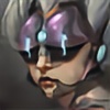
1.) Thumbnail Rough: I like to rough in all of my initial shapes as quickly and from the gut as possible. This is the part of the process you absolutely do not want to be caught up in. Draw shitty and draw fast just focus on the larger overall shapes and mood of what you are going after, this is design at its purest form before the art steps in. As a side note I like to draw in blue at this stage as it takes me back to my pencil and paper roots and also mentally helps you to understand that this is just a thumbnail sexiness need not apply.
2.) Clean Line Drawing: Now I go in and draw over the original blue line-art layer (usually setting the opacity of the original blue line to around 30-40%. Having this clear separation between the rough and the cleanup allows me to fine tune the art language and style without having to fuss over the design too much. My biggest advice if you ever want to ease the struggle of concept art/design is to learn how to separate the design process from the art process and tackle one at a time. (I know people may balk at the idea of even identifying them as different parts but I only want to illustrate the idea of this process as simple as possible.)
3.) Color block in: Nothing fancy here. I set the original line-art layer to multiply and then a new layer underneath to block in flat opaque color. I will also colorize the line-art to a hue that compliments my underlining color (shift+u and select the colorize tab in the lower right you will have to adjust the saturation and lightness for readability
4.) Initial lighting: With my color base set I then make a new hard light layer above that and using the color picker I de-saturate the color and use the layer to lay in value overtop of my color. The general rule here is that any value less than 50% will begin to darken and anything lighter will begin to lighten. The key thing is to de-saturate the color so you are not dumping and unneeded pigment onto the canvas.
5.) Further lighting: At this point I will make several new hardlight layer for each additional lighting pass needed. This is useful to keep the rendering smooth and consistent as once you have to many different values being painted on the same layer the effect begins to ‘artifact’ and darken in on itself over areas you have already painted.
6.) Rendering: At this point I like to flatten my layers down and begin rendering directly on the layer as needed. This is when I will start to call out individual details and begin to push my value range to the extremes of light and dark.
7.) Final Touch ups: At this point I noticed my color is a bit to subdued and go back to a hard light layer overlay and this time I saturate my values and begin to overlay contrasting values/colors to pop the image some more. Using a soft tip brush I will go in and add any skin imperfections and details that are needed as well as touch up any additional rendering. The biggest thing here is edge control especially along the silhouette of an object. Having cleanly defined edges will allow you to have a somewhat looser inner read and make a painting feel more finished than it actually is. Another great final touch Is to flatten any of the object layers together except for the canvas. Right click on the layer and select blending options>gradient overlay. Set the blend mode to soft light and style to radial. You can select and drag the light source around on the canvas in real time (also be sure to reverse the gradient so as the gradient fades outward it gets darker). This takes some tweaking with opacity and placement but is a solid quick way to solidify a concept piece for presentation quickly.
Image size
1273x6537px 740.32 KB
© 2013 - 2024 Rayph
Comments5
Join the community to add your comment. Already a deviant? Log In
thanks for showing us your process! <3